


Hey rooki.designers!
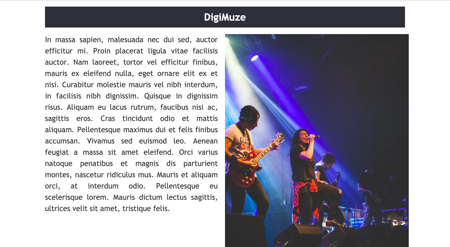
Welcome back to the second article in the Intro to HTML and CSS for Designers series. This week, we are going to be writing HTML and CSS to create the following two column layout for a band page. Before we get started, you can download the image used here!
To start, open up a text editor. There are many options you can use, including Notepad++; a basic text editor, or WebStorm; an integrated development environment. Either is fine for this week.
First, we need to create the main website file, which will create the HTML for the homepage of the website. To do this, create a file named “index.html” and save it into a folder where you will keep all your website files. Inside this file, you need to create the HTML code structure, as we discussed last week. This includes the doctype declaration, html, head and body tags.
<!doctype html>
<html lang="en">
<head>
<meta charset="UTF-8">
<title>DigiMuze</title>
<link rel="stylesheet" href="main.css">
</head>
<body>
</body>
</html>
Notice that within the <head> tags we have a <link> element, which contains a stylesheet. This is a link to the CSS file, which we will create later. I have named this “main.css”, however you can name yours whatever you want, as long as this matches what you put in the href of the link element.
Now we have our document setup, we can start to write the HTML for what is displayed on our website. I’ll be using semantic HTML, which means our elements describe their function. For example, the <section> element is for a section of our website.
Create a <main> element and give it an id of “wrapper”. This element will surround the entire webpage’s content, and act as a “wrapper” around it. We can access the styles of this element later on in the CSS using the ID assigned to it.
<main id="wrapper">
</main>
Within the <main> element, we are going to create three more elements. These elements have now become nested within the main element. Create a <header> element, which we will use to write the website heading in. Now, create two <section> elements, and give the first one the ID of “left” and the other the ID of “right”. These sections will make up the two columns we see in our final website. Remember to close your tags using a forward slash.
<header> </header>
<section id="left"> </section>
<section id="right"></section>
The next step is to add the code which actually contains the image and text for our website. Within the header element of our website, we want the text “DigiMuze” to display. To do this, we will use a <h1> tag. H tags are heading tags, and range from h1 to h6; h1 is the first heading, and h6 is the last subheading. Create a <h1> tag that contains the text “DigiMuze”.
<h1>DigiMuze</h1>
Inside of the <section> element with the ID of left, we will include the lorem ipsum text for our page with a <p> element. This is a paragraph element.
<p>
In massa sapien, malesuada nec dui sed, auctor efficitur mi. Proin placerat ligula vitae facilisis auctor. Nam laoreet, tortor vel efficitur finibus, mauris ex eleifend nulla, eget ornare elit ex et nisi. Curabitur molestie mauris vel nibh interdum, in facilisis nibh dignissim. Quisque in dignissim risus. Aliquam eu lacus rutrum, faucibus nisi ac, sagittis eros. Cras tincidunt odio et mattis aliquam. Pellentesque maximus dui et felis finibus accumsan. Vivamus sed euismod leo. Aenean feugiat a massa sit amet eleifend. Orci varius natoque penatibus et magnis dis parturient montes, nascetur ridiculus mus. Mauris et aliquam orci, at interdum odio. Pellentesque eu scelerisque lorem. Mauris dictum lectus sagittis, ultrices velit sit amet, tristique felis.
</p>
Finally, we need to add our image to the website within the second <section> element. To do this, we use an <img> element. This, perhaps unsurprisingly, stands for image. Within this element, we have a src attribute, which contains the location the image is stored, similar to the <link> tag’s href attribute. We also have an alt attribute, which should be filled with alternative text that will be used by screen readers to describe the image.
<img src="band.png" alt="four band members standing on stage">
That’s the HTML file completed! Right now, if you open this file inside a browser, it will appear plain with no styling to it. This is where CSS jumps in! Open up the main.css file you created earlier, and ensure it’s saved within the same directory as the index.html file.
The layout of a CSS declaration is like this:
target element {
rule: property;
rule: property;
rule: property;
}
Notice that every rule must be ended with a semicolon (;) before writing the next rule.
At the start of my CSS files, I like to do a small reset of browser implemented styles. To do this, I use an asterix (*) symbol, which targets every single HTML element. I then set the margin and padding to be 0 pixels. The margin and padding here is in relation to The Box Model, as discussed in the previous article.
* {
margin: 0;
padding: 0;
}
The font I have chosen to use on the webpage is ‘Trebuchet MS’ and as it will be used for all the fonts within the website, we can target the <body> element within the CSS and set that font family to ‘Trebuchet MS’.
body {
font-family: 'Trebuchet MS', sans-serif;
}
The reason we can declare this onto the body is because elements inherit styles of their parent elements. Therefore, anything within the <body> element will carry the same styles.
Remember we set up a <main> element with the ID of ‘wrapper’ in our HTML? We can target ID’s in CSS using a hashtag (#) followed by the ID name. In this case, it would be #wrapper. We want to give this element a width of 80%, and have it appear in the middle of the page. To get the element centred, we will set the margin to 20px auto.
#wrapper {
width: 80%;
margin: 20px auto;
}
The 20px refers to the top and bottom margins, and the auto refers to the left and right margins. This is a shorthand way of writing margin-top, margin-bottom, margin-left, margin-right. Our content should now be centred on the page.
Our sections need to display next to each other, rather than be stacked. To do this, we can use a concept called ‘Floats’. I won’t go into great detail about this, but there are great articles that explain floats in depth. There are newer methods for layout around, however floats are perfectly fine for what we are doing today. We want to float both of these sections left, and give them both a width of 50%.
section {
float: left;
width: 48%;
}
The actual layout of the webpage is now complete, and it is just styling we need to do on the left section and the header. On the left section we want the text to be justified. We do this with the text-align rule. The color of the text is the hexadecimal value of #373737. This is set using the color rule. The font-size is 24px, and set using the font-size rule. Finally, the line-height is 1.5em and is set using the line-height rule. As you can probably tell by now, a lot of CSS rules are self explanatory.
#left {
text-align: justify;
color: #373737;
font-size: 24px;
line-height: 1.5em;
}
Finally, we want to style the header of the webpage. All of the rules have been introduced today, so see if you can do that with the following information: Align the text of the header to be centre of the page (Note that CSS using American English spellings). Set the bottom margin (margin-bottom) of the header to be 20px to give it some breathing room. The padding of the header should be set to 15px. The hexadecimal code for the background colour of the page is #2F3039, and the font colour should be made white.
header {
text-align: center;
margin-bottom: 20px;
padding: 15px;
background-color: #2F3039;
color: #ffffff;
}
How did you do? Does your page look similar to the screenshot at the start of this article? There has been a lot to digest this week, so be sure to read over the information a couple of times if you found some of it difficult to digest. There are hundreds of CSS rules which can be used to style a webpage, and we have only just scraped the surface this week.
Check out the next issue, where we will take things further and look at more features with HTML and CSS.
Keep pushing yourself,
Mike.
